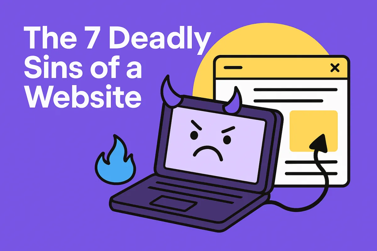
The 7 Deadly Sins of a Website (and How to Avoid Them)
The 7 Deadly Sins of a Website (and How to Avoid Them)
Let’s be honest—your website should be working as hard as you do. It should be booking trials, answering questions, and making people feel like they’ve found the place to be.
But sometimes, without even realising it, your website might be quietly turning people away. 😬
Here are the 7 deadly sins I see all the time—and how to fix them so your website actually does its job.
1. Nowhere to Go, So They Go Away
You’ve got a beautiful page with all the info… but no “Book Now” button? No enquiry form? No next step?
People are busy. If there’s no obvious direction, they’ll just exit. No hard feelings—they just didn’t know what to do next.
Fix it: Every page should have a clear next move. Want them to book? Say so. Want them to call? Give them a button. Don’t leave them hanging.
2. Zero Vibe = Zero Trust
You know what people don’t get excited about? Boring websites with cold language, bland photos, and robotic vibes.
If your website doesn’t make them feel something, they’ll feel nothing—and move on.
Fix it: Use warm, welcoming words. Show real people. Let your personality shine a little. You don’t need to be a graphic designer—you just need to feel human.
3. Don’t Make Them Work for It
If someone has to click through five menus, squint through a wall of text, and still can’t find a timetable or price… they’re gone.
Fix it: Make it easy. Like, “scroll-and-it’s-there” easy. Keep your most important info—what you offer, who it’s for, how to book—front and centre.
4. If You’re Not Confident, They Won’t Be Either
If your website looks unsure, outdated, or half-done, that’s the vibe it gives off. People want to feel like they’re in safe hands.
Fix it: Use confident, clear language. Update your content regularly. Show off a bit—reviews, results, or even just a “we’ve got this” tone goes a long way.
5. Stop Talking About Yourself So Much
Let’s be real: “We’ve been around since 2009 and we’re passionate about excellence” tells me nothing about why I should care.
Fix it: Talk to your visitors like they’re the star of the show. Instead of “We offer ballet, jazz, and acro,” say, “Your child can explore ballet, jazz or acro in a fun and friendly space.”
6. Info Is Fine, But Where’s the Invite?
Listing your class styles, timetable and prices is great—but it’s not inviting. It’s like handing someone a flyer and walking away.
Fix it: Turn every page into a soft nudge. “Ready to try a class?” “Want to see what we’re all about?” Make it feel like you’re holding the door open—not just shouting info from across the street.
7. Is This Thing Still Alive?
If your website still has last year’s dates, photos from 2017, and a few broken links… it’s not inspiring confidence.
Fix it: Set a reminder once a month to give your website a little love. Update photos, fix links, refresh the text. It doesn’t need a full overhaul—just a tidy up so it feels current.
Your website shouldn’t just sit there—it should be your hardest-working team member. If any of these sins are living rent-free on your site, it’s time for an eviction notice.
Fix them one at a time, and you’ll turn your site from a digital dead-end into a warm, welcoming, and high-converting machine.
And if you need help? You know where to find me. 😉
